New Club Jersey Shoot Out
Our President is asking for your input on this …
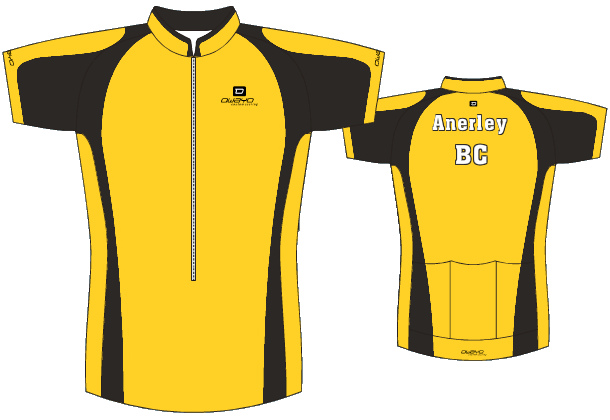
The story so far. Jeremy came up with the favoured front design:
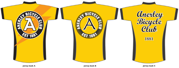
People were not too happy with the back. Phil P has come up with three alternatives A, B & C. Watchafink?
The comment box awaits.

I like option B the best option A is fine but i would lose the lightning bolt. Well done for taking the debate forward.
As a new member I don’t feel I deserve the right to comment but
C is the one I would choose. Italics work well with anything to do with speed! and the thought of having a ‘spare wheel’ on my back would slow me down! ( I do like the flash of lightening on A but then my name is Gordon!).
Well done Phililp as they all look good.
David (everso new member) Gordon
A looks best.
I like A and B. Not so keen on the lightning flash though….
Good that there is progress.
On balance I prefer Back type A without the lightning strike that makes the design too busy.
Type B letter ‘A’ looks too thin.
Type C is bold, very clear and simple without the target.