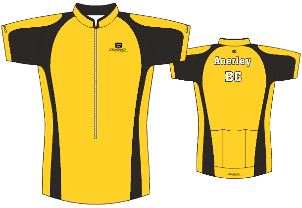
(Updated include Brian’s variant on Jeremy’s design 1)
Dear All,
I raised the issue of a new club jersey design at the AGM and did not get a great response. Not daunted, I have come up with some possible designs. I would be interested in which (if any) people like.
Design 1

(Revised by Brian from comments below)

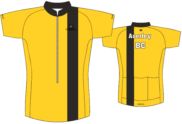
Design 2

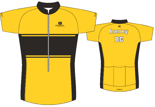
Design 3

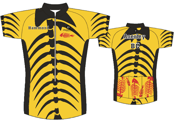
Design 4 (new)

I have got a quote for around £40 each if we order at least 10 (from www.owayo.com). So can people say if they would be interested (in principle) in ordering on.
There are many more patterns available if you look on the website but i came up with these three as a starting point. We can also add more text or logos if we want, you can have individual names as well.

I like design 1 the best, but like the idea of having the A roundel – as used in the sew-on club badge – used as the logo, rather than Anerley BC in white letters. Is that possible – and is it popular?
Hi Jeremy,
I’d buy/wear all of them except 2. Design 4 is more interesting but I think there’s maybe a bit too much going on for the words to show up clearly. No suggestions of how to get around that though.
Hi Jeremy, You have been busy!
Sorry but I still prefer the old (current) design.
As I have both long and short sleeve versions with many more years use in them, I won’t be looking for any replacements in my remaining years on a bike!
Graham says,
Hi Jeremy, Good idea, I would go for number 1 but don’t dislike any of them, we have to be carefull that anything we choose doesn’t look like Addiscombe
Louise says,
I like design 1 or 3. Less keen on design 2 but it’s better than the current kit which I do dislike. Sorry. Didn’t someone say that previous kit had the black band across the chest, if so that would be in keeping with previous tradition. I would be happy to order either design 1 or 3. Any reason why the club name is in white as opposed to black? What about black with a white outline to make it easy to read. Given that the club is so old could we squeeze a founded date on anywhere?
Just my thoughts.
Gina says,
Agree with Graham and Louise – like design 1 the best and would definitely wear it!
nice to see a new jersey design, number three is the best but anerley bc would be better in black,maybe you could go really wild and change the black for purple .
Jim M says
What about yellow and black chevrons!!! Now that’s wacky
Graham D says
Hi All, We would definitely be seen with the wacky design!!Within reason I don’t mind anything as long as it’s not Pink!!
I like number one best, maybe black wording rather than white? I will certainly buy one as it will be my first for Anerley.
We also like design 1 the best!
Would definitely prefer the logo to be in black.
Like Louise’s idea of having the founding date on it!
We’ll definitely buy it.
From Frank Kippin:
I would like to buy one of the ABC new shirts. Looks like a design debate is going on. A main consideration is that the quality is good.
When will a design be agreed for ordering purposes?
Regards
Frank
I agree with the Barnes’s.
Personally I think design 1- revised is neat and acceptable. Design 4 reminds me of the racing jersey I purchased some 20 years back,with black stripes,- being passed by a rider( often) was greeted with the remark,” you look a right Bee” I think they meant Bee not “B”.
Irregardless ofwhich designis setled upon I wish all who ride under Anerley colours the best wishes and fast times.
Siân